
Ways of Applying CSS to HTML
Applying CSS within the opening tag of a HTML element
Within the opening tag of an HTML element, the element can be stylized using a style property. Use by applying style = 'property1: value1; property2: value2' within the opening tag.
Inserting an Internal Stylesheet into the head of an HTML document.
CSS can be placed directly inside the head of the head element of an html page. Place CSS code within <style> tags in the same way you would in a seperate file.
CSS - Linking and External Stylesheet to an HTML file.
In the <head> tag of an HTML file, CSS files are linked and thus function to apply all of the styling to the page. To link a CSS file to html, a <link> tag must be applied with attributes of "href" set to the css file and the "rel" attribute set to "stylesheet".
CSS Overview
Rather than applying a style to different elements directly, CSS allows you to use a different syntax to apply format categories of html elements. In general, CSS application looks like:
div {
color: green;
}
In this example, div is a selector, everything between the {} is a declaration block, color is a property, green is a value, and the paired two of them is a declaration.
Suggestions and Practices
Some developers will choose to start their CSS file with a reset of default margin and padding values. This is done by using:
* {
margin:0
padding:0
}
CSS Selectors
A selector is how you write CSS in a manner that applies it to select HTML elements.
universal selector - selects all html and applies style ex. * {
type selector - selects types of tags ex. h1 {
class selector - selects all items that share the identified class. ex. .header {
Multiple classes can be assigned to one element to apply different styles. ex. <tag class='green big'>. green and big can each have a class applied style.
id selector - items with a specific id can be selected and styled. ex. #section2 {
Attribute Selector - elements with specific attributes can also be selected using CSS. For example, if an element contained an href value, select it using [href] {...
An attribute set to specific values can also be selected this way. Applying a select like this: [href*='tone'] {... will select any element with an href attribute set to a value containing "tone".
State Selector - elements in a specific state can also be formatted. This looks like "element:state". Example: a:hover {.....
Chaining Selectors - even more specificity can be achieved by chaining selectors to combine >1 criteria. Example p.header {... to select p elements with a class='header'
Descendant Combinators - this approach enables identifying types that are inside a parent element. Use a space between selectors to acheive this. Example: .main li {... to select list items inside a main class element
Multiple Selector combination - multiple selectors can be used seperated by a "," to enable application of the same format to multiple elements. Example: p, .trains {...
!important - this is a modifier on a attribute that ensures it applies regardless of assignments with greater specificity. Example: color: green !important; - this overwrites more specific assignments
Selector Specificity Preferences
When multiple selectors target the same element with conflicting attributes, the most specific selector overrides the less specific selector. This functions as follows:
id > Descendant combinator w/class > class > type
Style Element Attributes and Values to Set Using CSS
font-family - allows for the selection of a text font. Example: font-family: Arial;
font-size - allows setting of a font size. Example: font-size: 12px;
fort-weight - enables bolding or setting the weight of text. Example: font-weight: bold;
text-transform - use to modify text in stylistic manners
- uppercase - transforms assigned text to all uppercase letters.
color - use to change text to a specific color.
background-color - use to change the background color of an element.
background-image - can set an image as the background of an object. Example: background-image: url('folder/image2.jpg')
border - places border around element. Specify inside the size style color. Example: border: 2px dashed red
opacity - makes an element transparent or opaque (impacts container). Good to use for captions overlaying an image. Example: opacity: 0.75 (somewhat transparent)
text-align - aligns text to the left, center, or right of its container.
The Box Model
A picture of the CSS Box Model
- box-sizing - property set to define how the element calculates its dimensions (including margin, border, padding, content, etc.)
- content-box (default value) - requires manual assignment of width and height and factoring of seperate elements to define total height (content + padding + border)
- border-box - applies width to include the border. Width = will set the content + padding + border to equal the width.
width - the width of the content area.
- max-width & min-width - allows the defining of maximum and minumum width to standardize content appearance regardless of screens or resolution.
height - the height of the content area.
- max-height & min-height - allows the defining of maximum and minimum height to standardize content appearance regardless of screen or resolution.
padding - area between the content and the border
- Can set specific sides with top, bottom, left and right. Example: padding-top: 10px;
border - area with thickness surrounding the content and the padding
border - places border around element. Specify inside the size style color. Example: border: 2px dashed red
border-radius - allows a curvature to the corners of a border. Set as px's of a %. Note: 50% makes the element a circle.
margin - area between the border and the outer edges of the element.
- Can set specific sides with top, bottom, left and right. Example: margin-top: 10px;
- Allows centering of content in it's container by applying margin: 0 auto;. Only appears when the container has a defined width, as otherwise left and right margins are set to 0.
- Left and right element margins add to determine the full size. Top and Bottom margins alternatively do not add but are reduced to the largest margin.
overflow - attribute which depending on how it is set will affect how elements that are larger than their containing parent. Values to be set to include:
- visible (default) - makes content visible outside of the containing element.
- scroll - adds a scrollbar to the elements box to enable scrolling to see the element.
- hidden - makes content larger than the container hidden from view.
visibility - set to determine whether an element is even visible on the page
- visible (default) - an element is visible on the page.
- hidden - an element isn't seen on the page, but its space remains.
- collapse - an element isn't seen on the page and its space is removed.
This is content-box with a set width and a border. (120px + 10px border)
This border box width include the border. (120px includes 10px border)
Notes:
A picture explaining margin collapse
Dimensional Shorthand
Rather than setting each settings of padding-top, bottom, etc... each padding/margin can be assigned multiple values seperated by spaces to indicate these values. This works as follows:
- 1 number - applies to all 4 Example: padding: 4px;
- 2 numbers - applies first to top and bottom, second to left and right Example: padding: 4px 10px;
- 3 numbers - applied first to top, second to left-right, and third to bottom
- 4 numbers - applies numbers to top, right, bottom, and left in that order. Example: margin: 4px 4px 7px 10px;
HTML Flow - CSS Attributes
HTML by default will position elements from left to right and from top to bottom. These attributes manipulate these positionings.
- position
- static (default value) -
- relative -
- starting where it belongs, follow up relative by using the top, bottom, left, and right attributes to move an element on the page relative to its parent container.
- Apply to parent elements to move all content within.
- Content may overlap with adjacent elements with this rule applied.
- absolute -
- position assigned to absolute removes the element from the flow of the document.
- Element is positioned absolutely in line with the body, or the closest relative parent above it.
- Element remains in place but rest of document ignores it and falls into its place behind it.
- fixed -
- removes the element from the flow of the document.
- setting position equal to fixed results in the element being locked into its spot in the document.
- It is best to set top, bottom, left, or right values to ensure the fixed element behaves as desired.
- Works well when paired with z-index attribute to ensure fixed value remains on top.
- sticky -
- setting position to sticky will leave it in its place in the page until it reaches its offset point.
- This works within the element's parent (sticky will move until the parent element is off screen).
- display
- inline - occur within the line of text. They dont require a new line following their entry. their height and width cannot be modified as they will adhere to their linked text.
- can modify elements that are not inline by default to display it next to each other.
- ex. place an H1 element next to a p element.
- - example inline elements: strong, em, a
- block - elements that are not displayed in the same line as the content around them.
- width of these types of elements can be set.
- height can be modified as well, but by default is as tall as necessary to accomodate content.
- inline-block - combines features of both inline and block.
- can specify height and width of these elements
- will occur in line of each other. See these bullets as an example.
- z-index
- To prevent elements from overlapping one another in an un-intended way, z-index can be adjusted to account for depth. + numbers are above, - numbers are behind.
- Requires integer values. Does not work on static elements.
- Default value = 0
- float - move an element as far left or right within its parent container as possible.
- adding a float attribute to an element removes it from the document flow. Other content will wrap around floated elements.
- floated elements must have a width.
- clear - used to clear the left or right side of an element.
- if an element's left side bumped against a partial element, using clear can ensure it aligns left to the page edge.
- values = left, right, both, and none.
Inline H1
The p that comes after it.
CSS Color Styling
Color can be expressed in CSS using several different schemes.
Methods of Applying Colors
- Named Colors
- Hexadecimal Colors
- System utilizes system of 6 digits utilizing 0-9 and A-F.
- Example: sienna is #A0522D. Can set as color: #A0522D
- Hex color values can be short-handed if the same values repeat in pairs. Thus, #B4F is equivalent to #BB44FF.
- RGB
- color code that uses 3 number (0 to 255) to depict a color. Can set using color: rgb(0, 0, 0)
- These colors are the same as hex but with a different syntax. This can represent 16,777,216 colors.
- HSL
- HSL stands for Hue, Saturation and Light. This is another method of reflecting color using color: hsl(250, 70% 20%)
- Hue value can be set between 0 and 360 and references colors on a color wheel. Red is 0, Green is 120, Blue is 240, etc.
- Saturation affects the richness of a color. 0% is gray and 100% is a deep rich color.
- Light affects how light or dark the color is. 50% is normal lightness, 100% is lighter, 0% is closer to black.
- HSL is useful when making a color a tad darker would require changing 3 rgb values, but just one HSL value.
- RGBA and HSLA??? Or an 8 digit Hexadecimal?
- a final value can be added if the properties are changed to rgba or hsla called the alpha. This is effectively opacity.
- a set to 0 makes content completely transparent. Set to 1 and the color is completely solid.
- alpha can be set on a hexadecimal by adding two more digits (Octadeximal). These two digits range from 00(transparent) to FF (opaque)
CSS Font Applications
Several high level considerations apply to setting fonts on webpages. A font is selected by applying a font-family attribute to a text element on a html page. Example: font-family: Arial.
- If a font has multiple words in its name, the name of the font needs to be placed in ''. Example font-family: 'Times New Roman'
- Some fonts are not available on select browsers or Operating Systems. Web-safe fonts that appear on most systems can be referenced here: WebSafe Fonts
- Fallback fonts are a best practice to ensure one of a selected font is used. Example: font-family: Caslon, Georgia, 'Times New Roman'
- The final Fallback font can be set to either serif or sans-serif to default to a font of these generic types.
The following specific attributes can be modified to further customize font on the page.
- font-weight - affects how bold or thin text will appear on the screen. Some properties that can be assigned include:
- bold - bold font weight
- normal - Normal font weight (and the default value)
- lighter - One font weight lighter than the element's parent value.
- bolder - One font weight bolder than the element's parent value.
- more generally this can be set between 1 and 1000. 400 is normal and 700 is bold.
- font-style - can set to select values to change the apprearance of font.
- set to italic formats texts in italics. The default value is normal.
- text-transform - can alter text by changing all text to uppercase, lowercase, or capitalize the first letter of each word.
- letter-spacing - can space letters.
- word-spacing - can space out words
- line-height - can modify the height of a line.
- text-align - can modify whether text aligns to the left or right or center of its container.
Using Web Fonts
Links can be placed in the header of an HTML document to enable the use of webfonts using services like Google WebFonts
See this text using Google Bebas Neue font.
- There are 2 primary methods to accomplish using webfonts
- embedding a webfont link in the html document head.
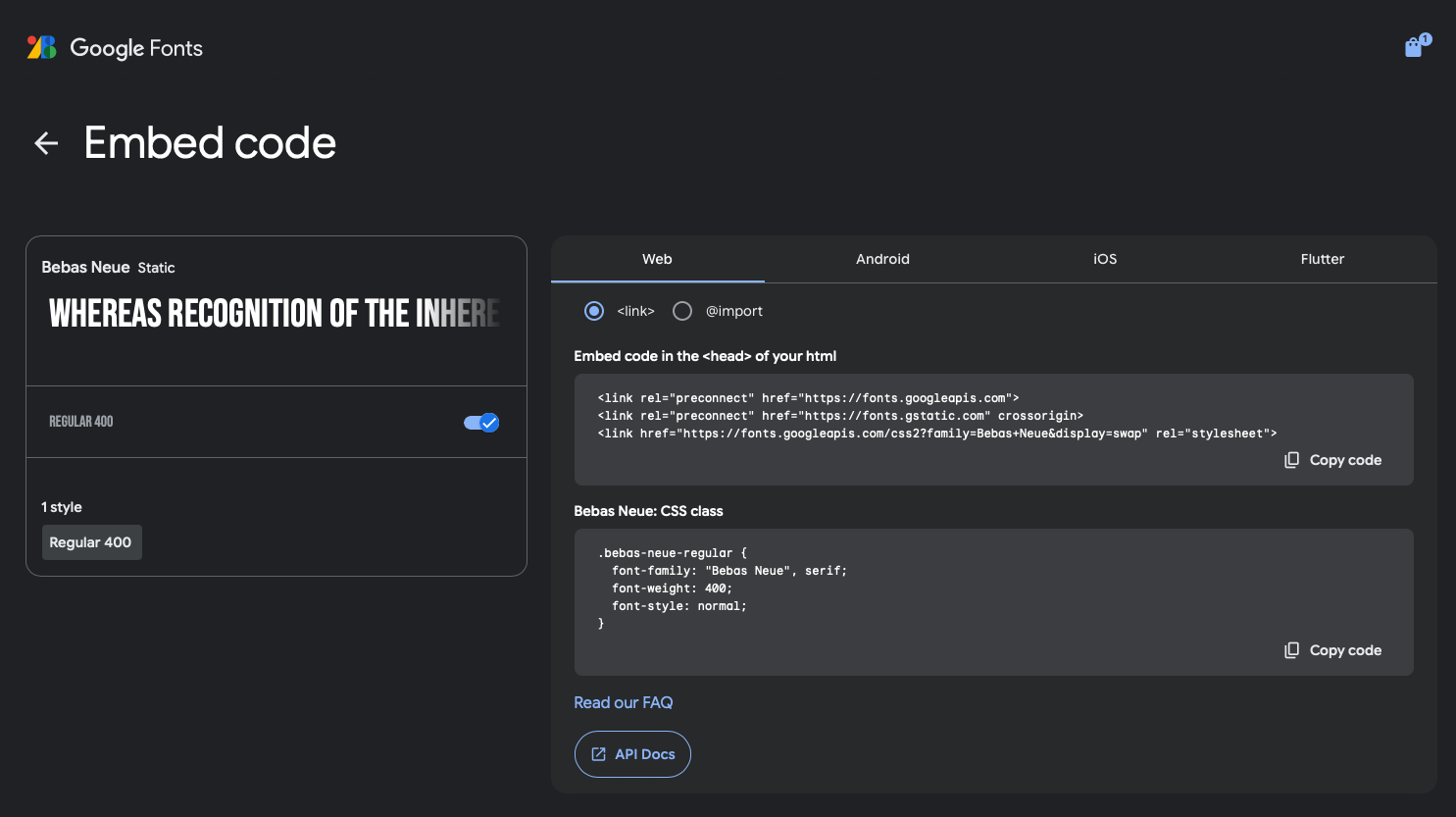
- Visit GoogleFonts and select the desired fonts. Click the shopping cart icon in the top left corner. Select "Get embed code" and then copy the code into the head of the html file.
- Once this is done, the font can be used like a normal font. This method relies on the browser accessing the file being connected to the internet.
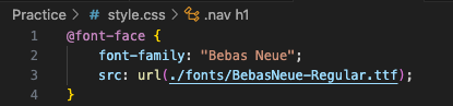
- Downloading the font files, storing them in a folder, and adding an @fontface selector to the css style page.
- add @fontface {... then specify a font-family:... and as many src: url(...)} as you have files for the font.
- Once it has been added to a fontface, it can be applied to text in the HTML document.
CSS Links and Buttons
When visiting webpages, it is helpful to design specific text in a manner that helps the user better navigate information. Several elements are uniquely styled with this in mind.
- Links -
- Links are colored blue and underlined by default to make them easier for the user to spot. Here is an example Link
To be Continued on Pg.3 of Links and Buttons...